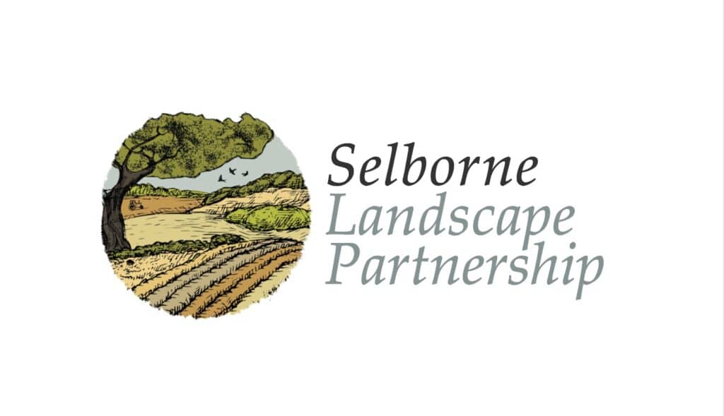
The brand concept was rooted in the unique landscape of Selborne championed by Gilbert White and at the hear of each of the farms involved. Inspiration was drawn from local flora, fauna, and field patterns, alongside references to handwritten journals and traditional illustration styles associated with early naturalists.
A logo mark was developed using organic forms and subtle linework, evoking both the contours of the surrounding countryside and the idea of interconnected habitats. The colour palette was derived from natural tones—soft greens, earthy browns, and chalky neutrals—reflecting the Selborne landscape.
Typography balanced heritage and clarity, combining a classic serif style with a clean, modern sans-serif to ensure readability across applications.
The identity system was designed to be practical for everyday use, from farm signage and wayfinding to educational materials and community engagement initiatives.
Enhanced visibility and understanding of the cluster’s environmental work
Stronger sense of collective identity among participating farms
Increased engagement with local communities and visitors
The resulting brand provides a cohesive and recognisable identity, strengthening communication and public engagement. It successfully connects contemporary environmental practices with the historical significance of the area, supporting both environmental stewardship and meaningful storytelling.