A critical requirement of the project was to retain elements of the existing identity, requiring a sympathetic and strategic redesign approach, balancing heritage with transformation.
The brand refresh followed a structured and insight-led process:
Brand Audit
Evaluating the existing identity, tone of voice, and visual inconsistencies
Stakeholder Engagement
Ensuring student voice and community perspectives were embedded in the process
Brand Strategy Development
Defining purpose, values, positioning, and personality
Visual Identity Exploration
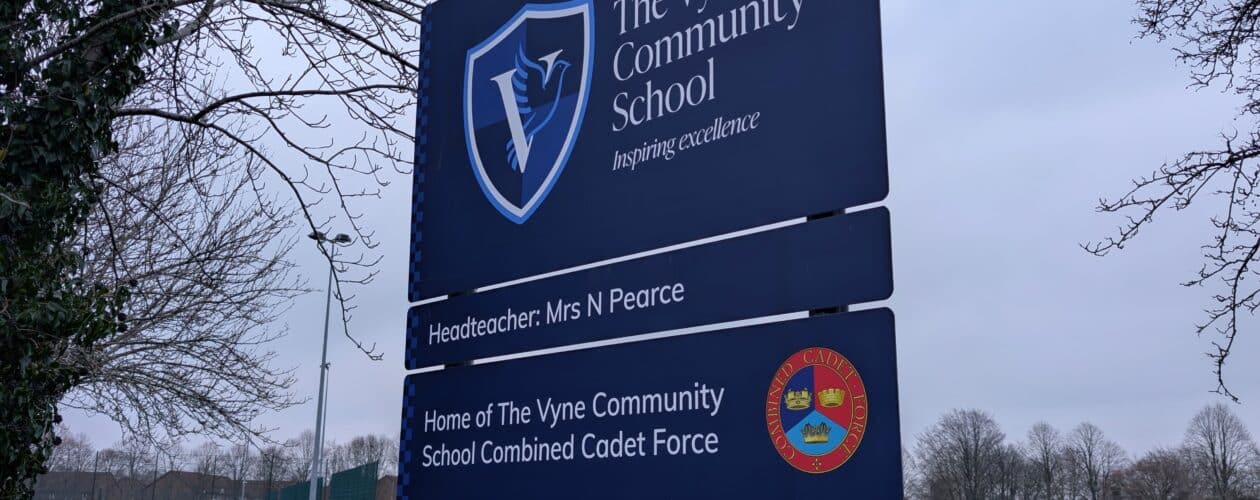
Reimagining the dove icon and creating a cohesive design system
Tone of Voice & Messaging
Developing authentic, student-informed brand language
Refreshing the brand
Delivered a cohesive and meaningful visual identity
Reconnects the school name, symbol, and narrative
Reflects a modern, aspirational learning environment
Amplifies student voice and authenticity
Creates a welcoming and community-focused presence
Positions the school alongside forward-thinking educational institutions
This project demonstrates how strategic design can go beyond aesthetics—redefining identity, strengthening community connections, and shaping perception.
By aligning brand with vision, The Vyne Community School is better equipped to communicate who they are today—and who they aspire to become.
The project launched with deliverables across all touch points including external signage, stationery, digital assets, asset templates and presentation tools.